Updated Ultimate Chicago
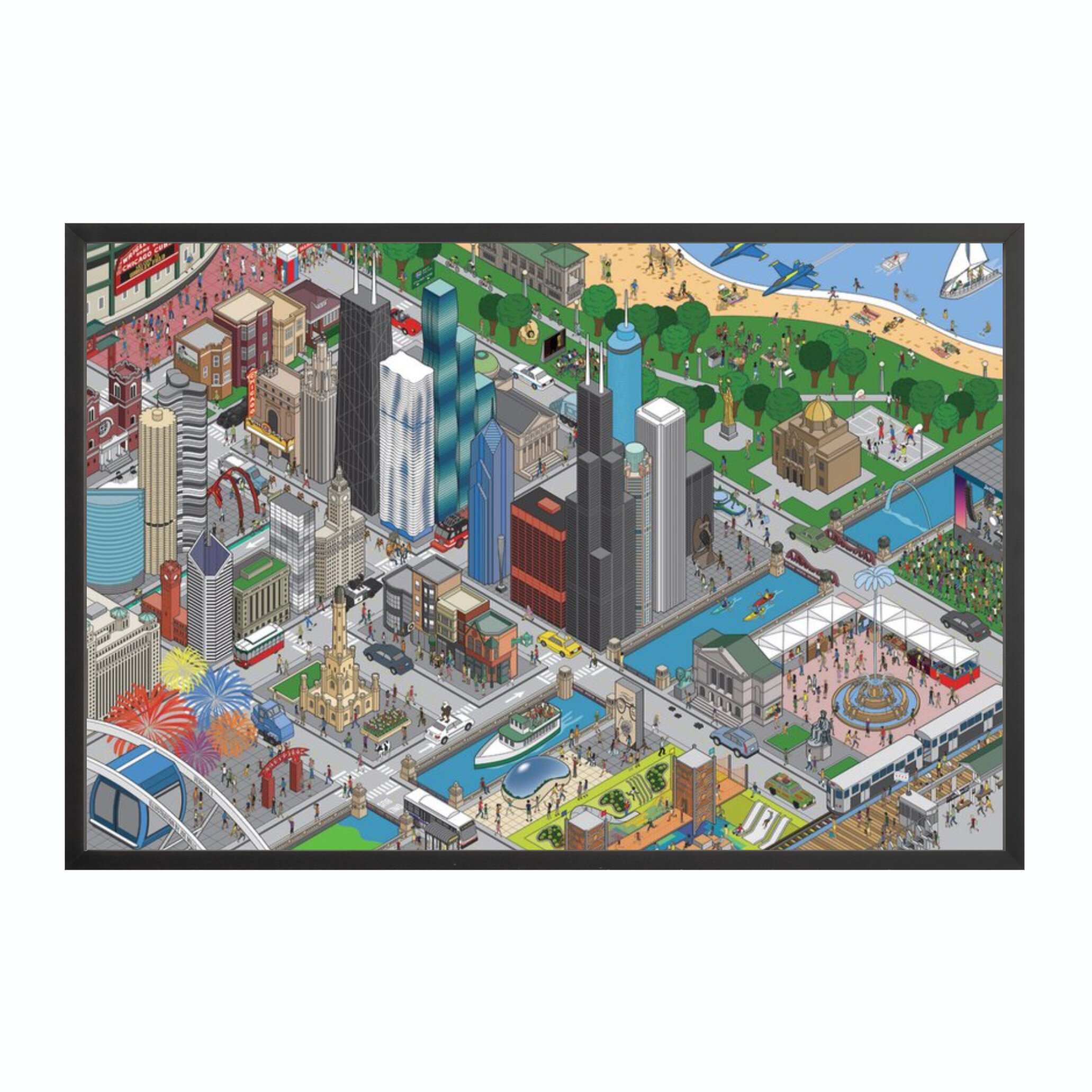
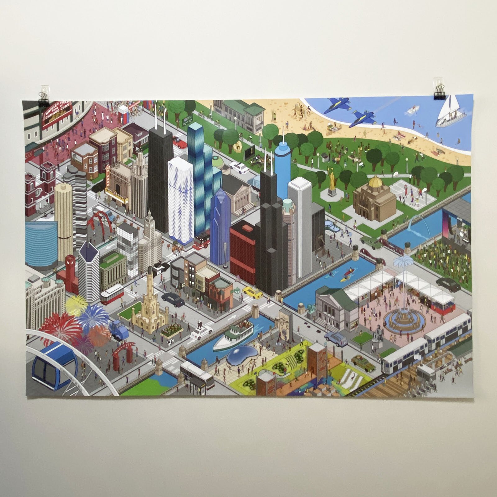
Updated version for 2019! As the title states, this is the ultimate Chicago illustration. All the major landmarks, buildings and icons of Chicago all in one large scale isometric cityscape.
New in this version: Vista Tower, a bungalow, updated Aqua, Marshall Field’s clock, construction workers, Bud Billiken parade, Ferris Bueller float
Easter eggs to find: Lincoln Park Zoo lion, Bill Murray, Super Fan, Chris Farley, Harry Carey, Steve Bartman, Ronnie Woo-Woo, Bozo, Eagleman, Al Bundy, Malort face, Rainbow Cone, dibs, potholes
Ultimate Chicago Detail
Ultimate Chicago Detail
Ultimate Chicago Detail
Original Ultimate Chicago
Ultimate Chicago
This poster was 10 years in the making. My first job out of college was as a toy designer. When I left that job after three years to become a teacher, I never considered that I would return to art. After finishing school, I took a job as an art teacher and art came back into my life. In turn, I became more interested in building a portfolio of my own personal work. One of my big inspirations for returning to art was the work of eBoy. One of the things they are known for are these crazy isometric city scenes like this one of San Francisco:
I had decided back then that I wanted to do something like that for Chicago. In fact, my very first piece I completed was this pixelized version of the Chicago skyline:
Now, I can laugh at the exorbitant amount of time I spent on it. At the time, though, it was a major undertaking. The end result is very conservative compared to eBoy. However, I was practically starting from square one so I had to start somewhere. After a few years experimenting with different types of art making, I was finally ready to do something more like an eBoy version of Chicago. In 2009, I finished and printed my first Chicago poster:
I didn’t know it at the time, but it really jump started my entire line of Chicago prints that I have now. Considering what I set out to do, I accomplished all of my goals with this poster. And to this day, it remains one of my favorite pieces. However, I hadn’t pushed it as far as I knew I could take it. My skills and confidence weren’t all the way there yet. I had 500 of them printed. And I knew that when I sold out of them, it was time to start Ultimate Chicago. In the summer of 2015, I sold out. Thankfully, my confidence level and my skills had reached the right point to get the ball rolling.
With Ultimate Chicago, I challenged myself to fit in as many Chicago landmarks and icons as I could into one 24″ x 36″ poster. While I never set out to make it as eccentric as the eBoy cities, I did want to make it as densely packed. I started with all the buildings since I considered that to be the focal point. From there, it was time to put in all the people. I had originally wanted to include as many possible references to Chicago in this poster. For instance, I wanted to include both Daley mayors, Oprah and Jordan just to name a few. In the end, though, I liked that the illustration had a major focus on the buildings, icons and landmarks. In turn, I just used the people as a way to populate the space.


